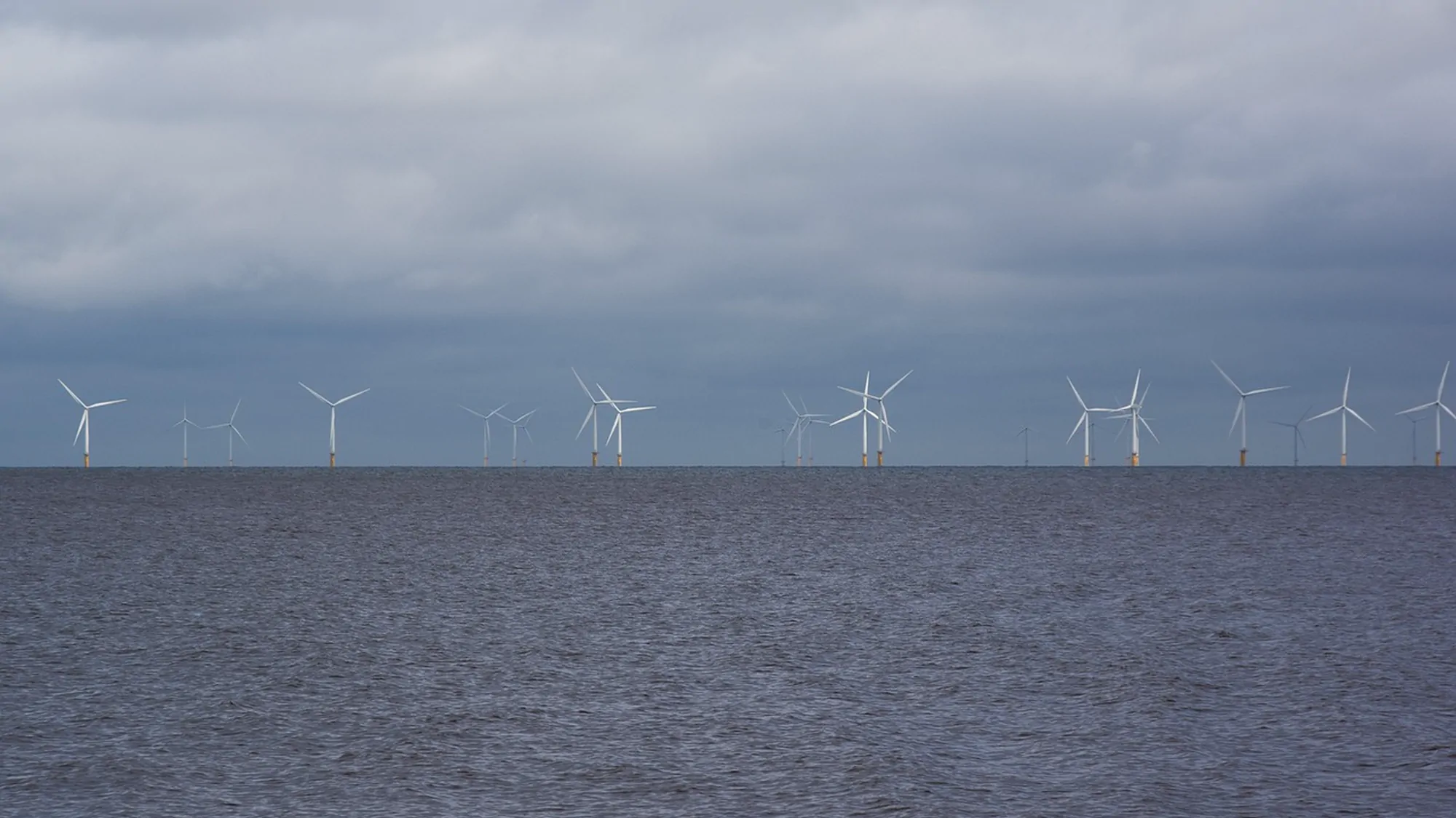
Northmoor Wind — Energy infrastructure, 2025
Making a fifteen-year build legible to everyone who has to live with it
Northmoor had planning consent, a seabed lease and no way of explaining itself. Three audiences wanted three different things from the same company, and the company was answering all of them in the same grey deck.
Context
A company that existed mostly as a planning document
Northmoor is a 1.4 GW offshore programme off the north-east coast, consented in 2023 and due to export first power in 2031. When they came to us they had eleven people, a seabed lease, a supply-chain commitment to the region and a website that looked like a legal disclaimer with a photograph on it.
The difficulty was not that nobody understood them. It was that three groups understood them completely differently, and each group's version of Northmoor made the other two uneasy. Investors wanted an operator with a conservative delivery record. Four coastal towns wanted to know what happened to the harbour. Engineers wanted to know whether this was a serious place to spend a decade.
The frame
We stopped trying to write one story
Instead of a single message, the strategy gave each audience its own entry point into the same evidence. The identity had to be flexible enough to hold all three without becoming three brands.
Capital
Proof that a first-of-its-kind programme will not slip.
A quarterly build record published in the same layout every time — dates, tonnage, consent status, nothing softened. Dull on purpose, and the only place the numbers appear.
Coast
Answers about the harbour, the jobs and the view.
A plain-language programme map, printed at A1 for town halls and reproduced as the site's only interactive page. Written at reading age 12 and reviewed by two community boards before launch.
Crew
A reason to move to the north-east for ten years.
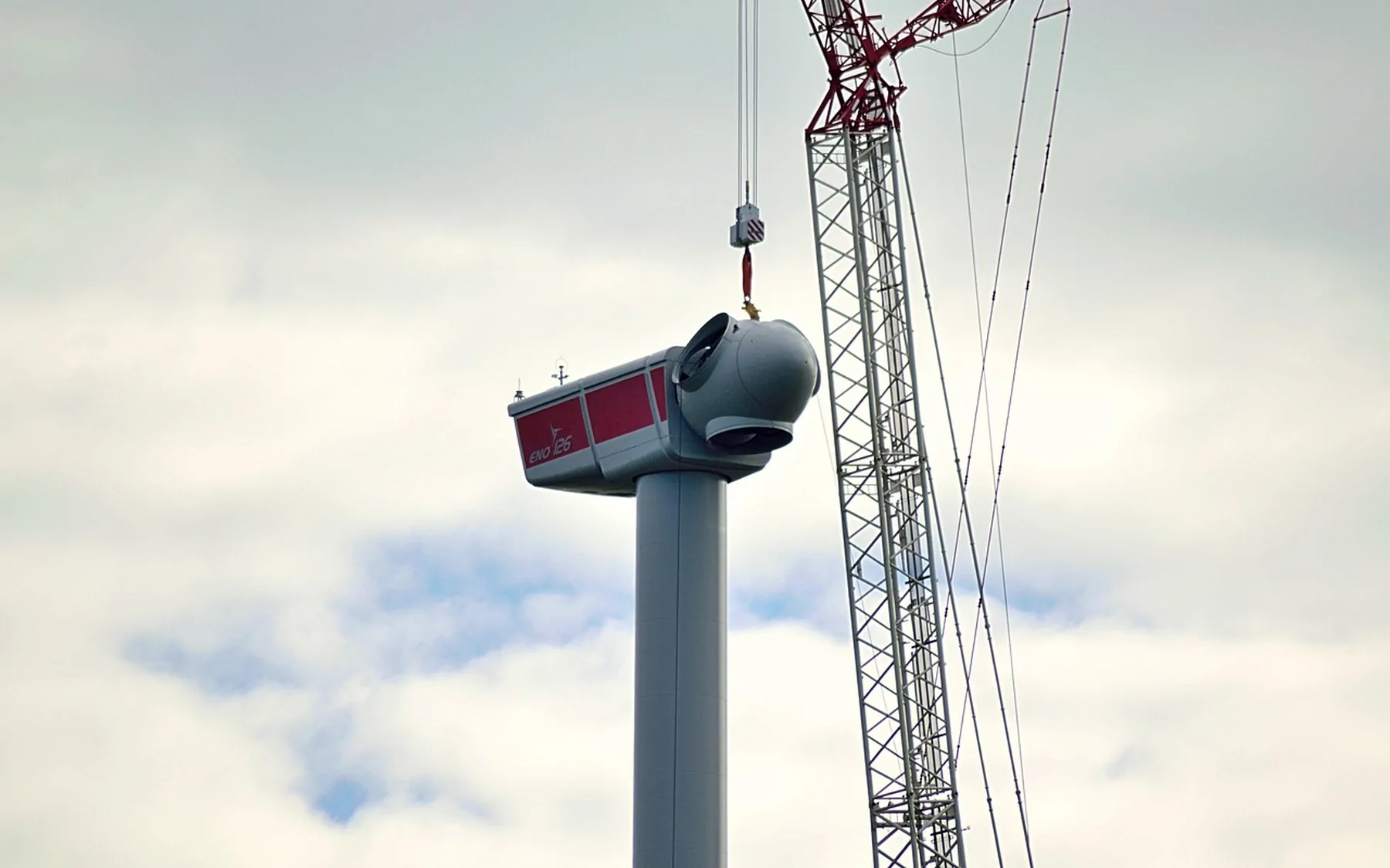
Recruitment material built from the actual work — survey vessels, cable ploughs, the met mast — rather than stock photography of people in hard hats pointing at things.
The system
A mark that survives being embroidered onto a survival suit
The identity is built around a single measure: a 24-unit horizon rule that sets every margin, every chart baseline and the spacing of the wordmark. It reproduces at 8 mm on a hard hat and at four metres across a quayside hoarding without redrawing.
Prussian blue is the only colour with any saturation in the system. Everything else is the grey of galvanised steel and the off-white of survey paper, which means a single blue line reads as information rather than decoration — a consent boundary, a cable route, a date that has moved.
We wrote the guidelines as forty pages of rules and one page of permissions. The permissions page is the one people use.
“We were told our old deck was 'reassuring'. It turned out that was the problem — it reassured everyone equally and convinced nobody in particular.”
Outcome
What changed
3×
Applications per engineering vacancy
Quarter after launch, measured against the same four roles reposted.
11
Town-hall sessions run on the new materials
Across four coastal authorities, using the printed programme map.
1
Visual system
Covering vessels, PPE, planning submissions, the investor record and the site.
What we would do differently
We designed the community map as an interactive page first and printed it second. It should have been the other way round: the A1 print is what changed the room, and the web version spent two sprints catching up with a document people were already holding.
Strategy
Ines Aldaz, Tobias Renn
Design
Marta Oyelaran, Cai Ferreday
Engineering
Ruth Ekhator
Production
Halldór Sæmundsson
Next project
Verrine
Turning a contemporary dance company's marketing calendar into an editorial system that runs itself.